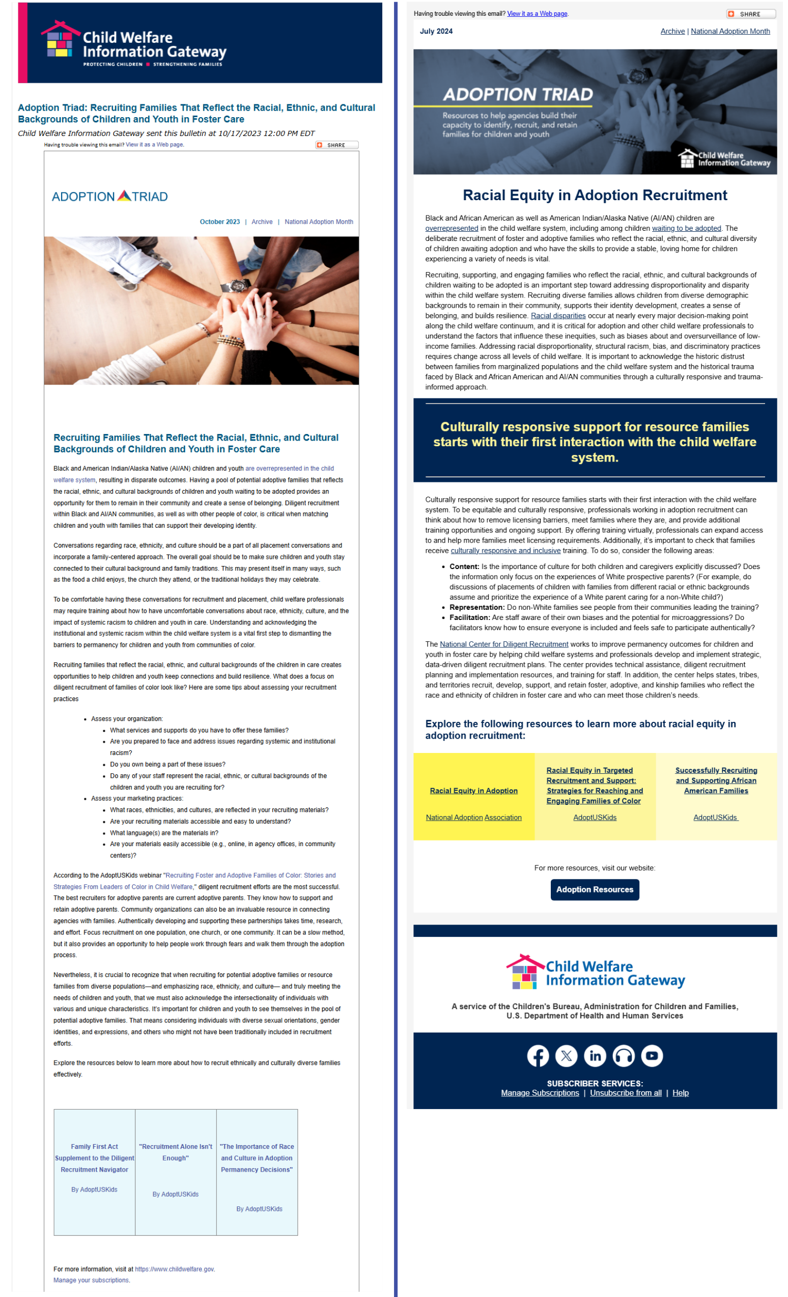
Adoption Triad Newsletter Redesign: Content & Brand Strategy
Role: Lead Content and Brand Strategist
Content Strategy ● Brand Alignment ● Editorial Planning ● Email Marketing ● Audience Development ● Template Design

Project Overview
🏆Commissioned on the strength of previous work. Following the successful redesign of CWIG's flagship E-lert newsletter, I was asked to apply the same strategic approach to a second publication: the Adoption Triad.
This wasn't a repeat assignment. The Adoption Triad served a distinct, specialized audience with its own content needs, emotional context, and brand requirements. While the E-lert needed modernization and a refined content strategy, the Adoption Triad needed brand alignment, visual restructuring, and a design that could convey sensitive, complex subject matter with clarity and credibility.
The Challenge
Low readability
Dense, text-heavy formatting with no visual breaks and weak calls to action made it hard for readers to engage with or act on the content.
📃
📱
Poor mobile responsiveness
Limited optimization led to a poor reading experience on smaller screens, where a growing share of the audience was reading.
🎨
Weak brand alignment
Outdated styling and no branded banner didn't reflect the organization's professional identity or signal the credibility the audience expected.
For readers dealing with emotionally complex topics like adoption, family systems, and child welfare, a newsletter that was inconsistent or difficult to read wasn't simply a design issue. It was a matter of engagement and audience trust.
My Approach
-
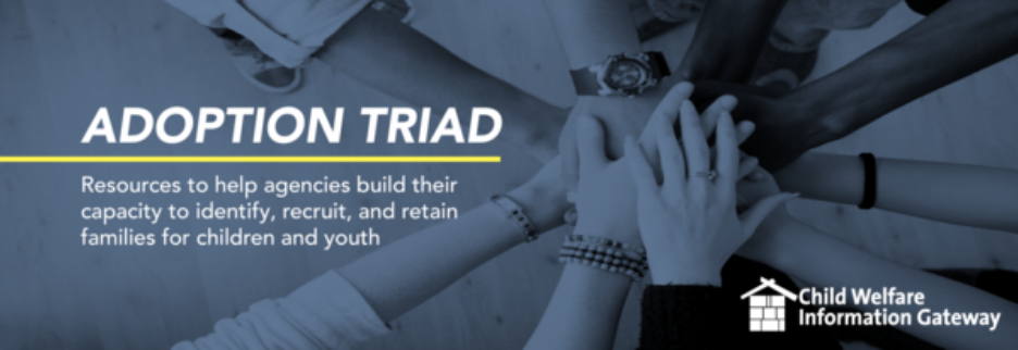
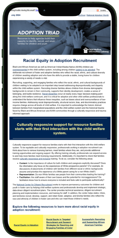
I built a branded email banner specific to the Adoption Triad that visually aligned it with CWIG's broader publication family while giving it its own distinct identity. I updated the color scheme, styling, and footer to connect readers to the organization's full digital ecosystem.
-
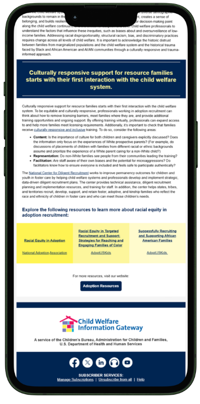
I restructured the content architecture, introducing block quote spaces to break up text-heavy content and highlight key statistics and calls to action. I created a modular section dedicated to promoting three relevant supplementary resources, increasing their visibility and click-through. And, I translated the existing content into shorter, more scannable, action-oriented blocks
-
The Adoption Triad audience is specialized and emotionally invested in the content. Every structural and editorial decision was made with that reader in mind, from larger font sizes that improve accessibility to stronger CTAs that guided readers toward the resources most relevant to their work and lives.
The redesigned Triad featured:
A modern, mobile-first template built for clarity and credibility
Modular content blocks, making complex subject matter more scannable
New branded color scheme and email banner specific to this publication
Stronger CTAs drivings readers toward priority resources
Cohesive branding connecting the newsletter to CWIG’s full digital presence.
The Solution
The Results
Within the first 6 months post-launch, the newsletter achieved:
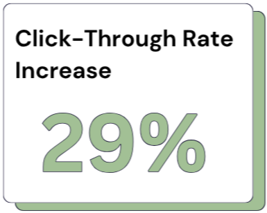
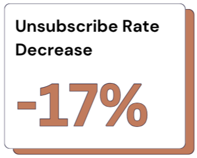
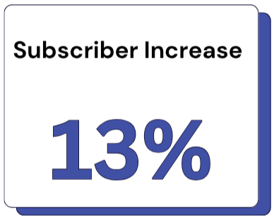
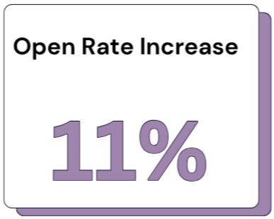

"This subscription really needed a makeover and this new version makes me actually want to read it!"
— Reader Survey Response
"The updated look feels modern and professional.”
— Reader Survey Response
"I'm clicking into resources more often than I used to."
— Reader Survey Response
"I'm more likely to click through and explore additional resources now."
— Reader Survey Response
Key Takeaways
This project demonstrated that the content and brand strategy developed for the E‑lert was not a one‑time success but a repeatable approach adaptable to different audiences, publications, and emotional contexts. By treating the Adoption Triad as a distinct communication challenge rather than a direct transfer of an existing model, I delivered a redesign that readers noticed, appreciated, and engaged with more deeply.
The work strengthened my expertise in designing communications for complex audiences and highlighted my ability to lead multi‑step, cross‑functional redesigns that elevate both content and user experience. Being commissioned for this project, following the success of a previous one, further reflects trust in the consistency, quality, and impact of my work.
BEFORE
AFTER